Primary Logo
The horizontal version of the logo is the primary and preferred version for most cases. If we need a small logo, a logo for avatar in social media, or other cases when the logo should be square - please use Proxet Symbol.
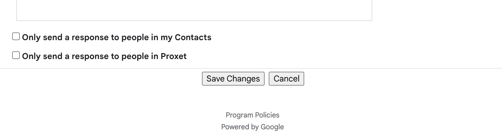
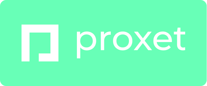
Version for black backgrounds
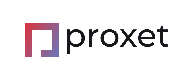
Version for brand color background
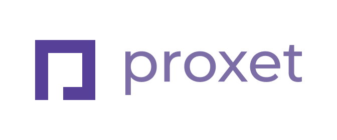
One-color version
The one-color logo should only be used where it is impossible to use a color version - document printing, silk-screen printing, embossing, etc.
Clear Space
The distance from the logo to the edges or closest elements should be at least half the size of the symbol.
Incorrect logo usage
Inconsistent logo and Proxet symbol usage hinder our brand value and recognition.
Any form of distortion or alteration to the Proxet logo goes against our efforts to maintain consistency. The following examples demonstrate what should be avoided.
Do not change the colors of the symbol or wordmark.

Do not use the wordmark on its own without the symbol.
Do not use on low contrast background colors.
Do not outline logotype.
Do not use the white logo version on unspecified colors.
Do not add unnecessary filters or effects.

Do not use the logo over complex backgrounds.
Do not change the distance between the symbol and the wordmark.
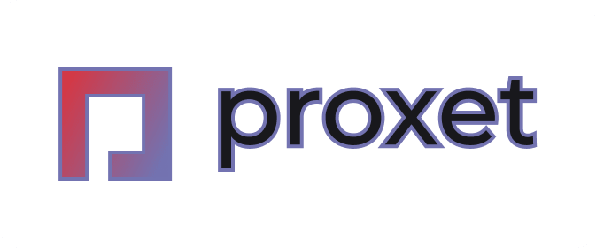
Don't add any strokes.
Proxet Symbol
Short-hand identifier for Proxet. The small version of the Proxet logo is reserved for use at extremely small sizes such as fav icons or avatars for social media.
On gradient (white) version
One-color (black) version
Avatar for social media
Below you can download ready-made avatar for social networks on a white background.
Color Usage
The new Proxet brand identity offers a minimalistic color palette, with the dominant use of white background (70%), black (text, buttons - 25%), and brand gradient (5%).
Сore website palette uses more than 20 tones. But you don't need all of these colors in real use. Below you will find the main colors that are used most frequently.
Dark
Used for headers, buttons and when we need black.
Text Gray
Used for large amounts of regular text paragraphs.
Gray
Used for subtitles, or when we need gray color.
Light Gray
Used for disabled items, decorations, and borders.
Violet
Used for links, highlights, some interactive elements etc.
Red
This color can be used for physical assets such as T-shirts, cups, and other merchandise if a suitable Violet shade is unavailable. The mentioned Pantone color serves as a reference, but similar shades are also acceptable.
Brand Gradient
Proxet brand gradient which we use on the logo is used mostly for headers - like website top sections or presentations intro slides. This gradient should not be a lot - otherwise the design will lose its restraint and minimalism.
Fonts & Typography
We use a combination of two fonts from the Google Fonts library in our new Proxet branding. This means that these fonts are absolutely free, and also supported by all Google services (Docs, Sheets, Slides etc.).
Inter
Basic font used for text paragraphs, small headings and interface elements.
Example:
Archivo
The font used for headings & title. If we need text more than 20px - use this font.
Example:
Note: This font does not support cyrillic alphabet, so if you want to use the cyrillic alphabet, use another Google Font - Manrope.
How to use these fonts?
To use these fonts in Google services, you just need to add them through font selection. You don't have to download and install anything on your computer. Also, these fonts will be saved in your account, and next time you will not have to add them.
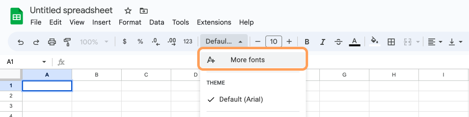
STEP 1:
Open font selector, and then - select "More fonts".
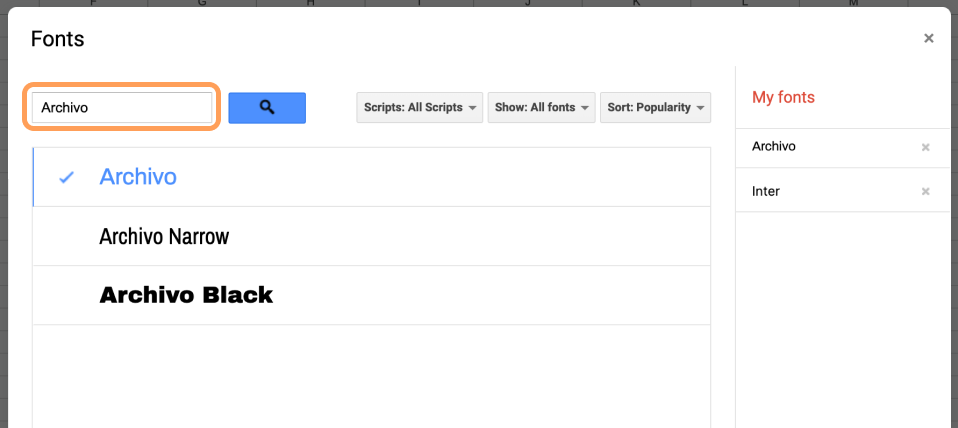
STEP 2:
Fill in the names of the fonts (Inter & Archivo) and select them.
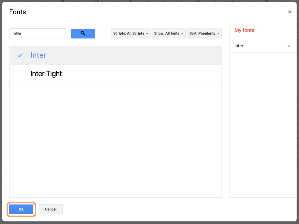
STEP 3:
After selecting two our fonts click OK. After this you can select these fonts in font selector.
What if Google Fonts is not supported?
If you can use fonts downloaded on your computer, you just need to download fonts, install and use (How to Install Fonts?).
In case your service or software does not support using Google Fonts, or adding custom fonts - we use Arial font for all text elements.
Background for Video Calls

Sometimes our background during calls doesn't look the best - the mess in the room, family members, whatever. That's why we have a solution for you - a branded background. 🙂
Templates
How to use it?
If you want to use a template, you should open it and make a duplicate. Then edit this duplicate.
Please note: if you are making an external presentation - send it to the designers for polishing before sending it to clients.

If you need some help
If you need any assistance, feel free to reach out to our designer, Sergey Tomkovich, for help or Scott Nevins, our Marketing Director, for advice!

Sergey Tomkovich
sergey.tomkovich@proxet.com

Scott Nevins
scott.nevins@proxet.com